Portfolio
Design System Strategy — Scaling, Migrating, Still Shipping
The product portfolio included a marketplace, a SaaS application and backoffice tools. I developed the shared component architecture and Figma library in close collaboration with frontend engineers. As the engineering team grew, the system raised a practical investment question: how much of the common interface infrastructure should we continue to maintain ourselves?
Process
Phase 01
Establish the shared vocabulary
I designed and built the Figma component library, covering variants, states, forms, alerts, modals and light and dark modes. The structure made recurring interface decisions explicit and gave design and engineering a common reference.
Phase 02
Maintain it through real product work
During its first two years in production, I worked with two frontend developers to extend the system as product needs evolved. Maintaining the library and documentation alongside delivery exposed where common rules held and where the model needed more detail.
Phase 03
Adopt a library without losing continuity
The move to MUI aimed to reduce the burden of maintaining the technical foundation. I supported the transition from the design-system side. A relatively light theme customisation preserved the existing visual language, making the change unobtrusive in the migrated interfaces.
Phase 04
Allow the migration to follow priorities
New contexts used MUI while lower-priority areas retained proprietary components. Coexistence carried its own maintenance cost, but allowed migration to follow business priorities rather than demand a complete replacement for consistency’s sake.
Methods
Component architecture
Variants, states and display modes formed an explicit model that supported implementation and later transfer.
Migration readiness
Knowing the existing system made it possible to identify MUI equivalents and define where customisation was needed.
Support engineering autonomy
The library, tokens and documentation gave engineers usable guidance for recurring decisions across products.
Think across the portfolio
A common foundation needs to accommodate different application contexts, including different priorities for migration.
Visuals
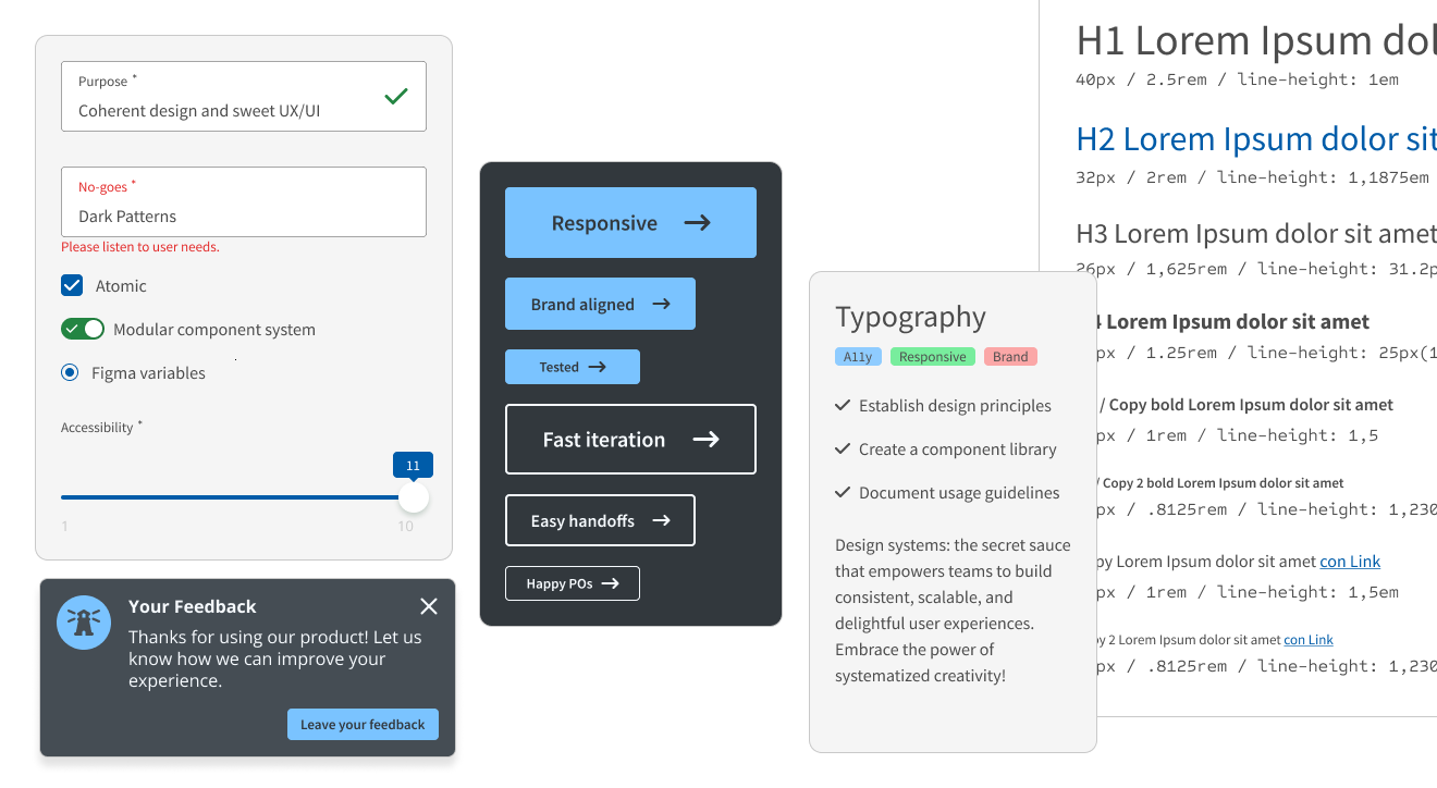
The component library provided a shared reference across products.
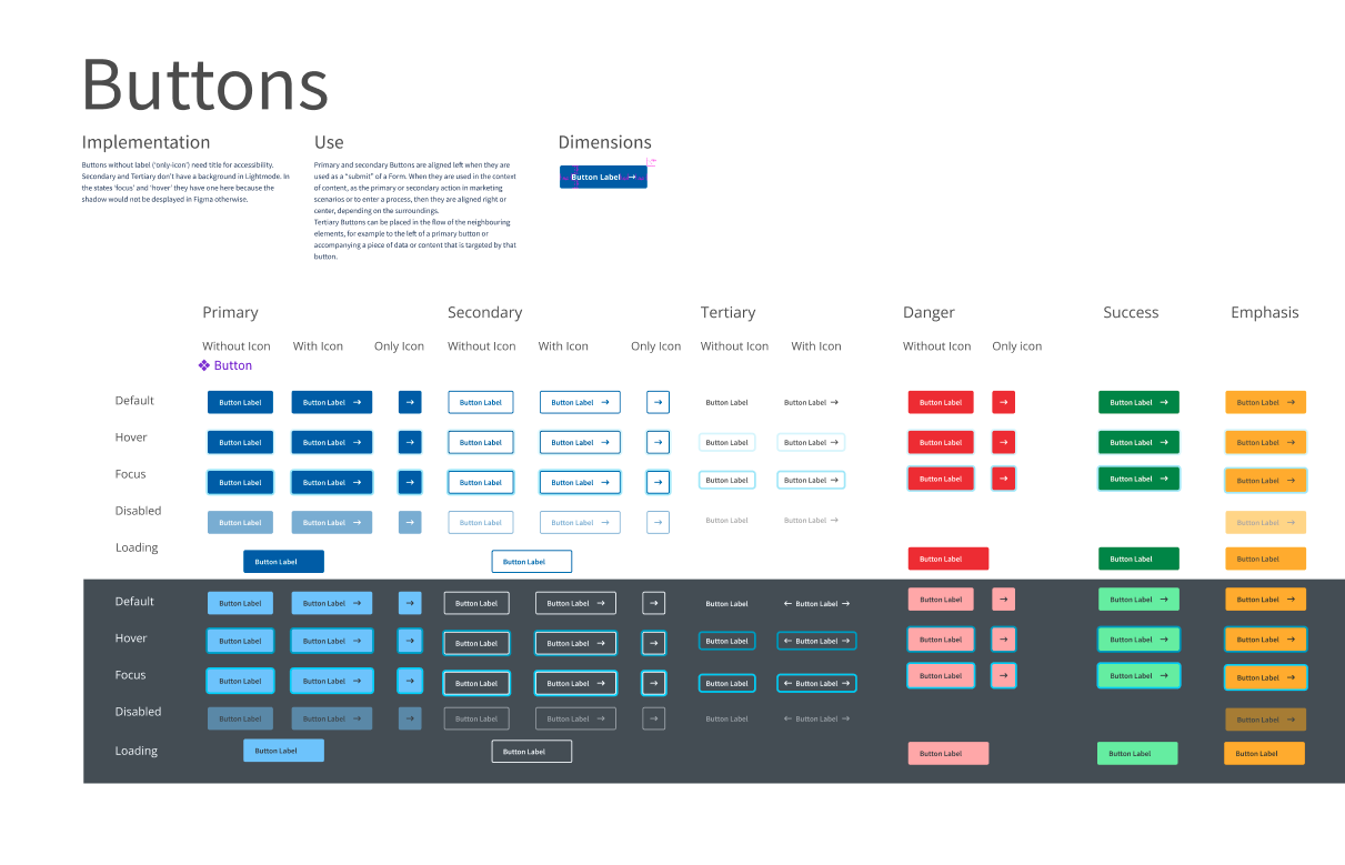
Button variants illustrate part of the shared component model.
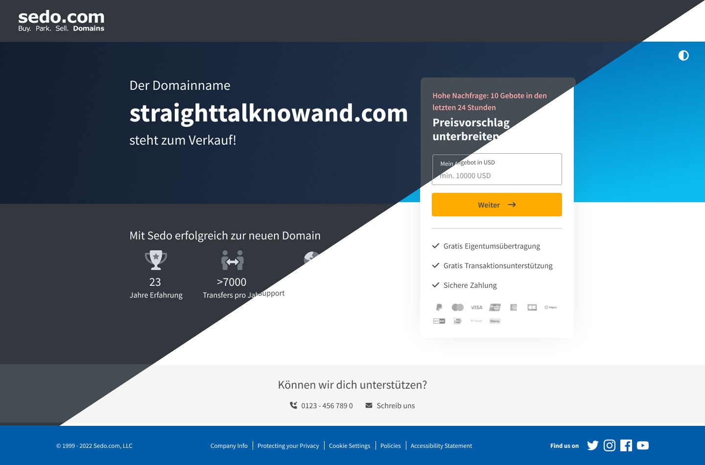
Light and dark modes within the same design foundation.
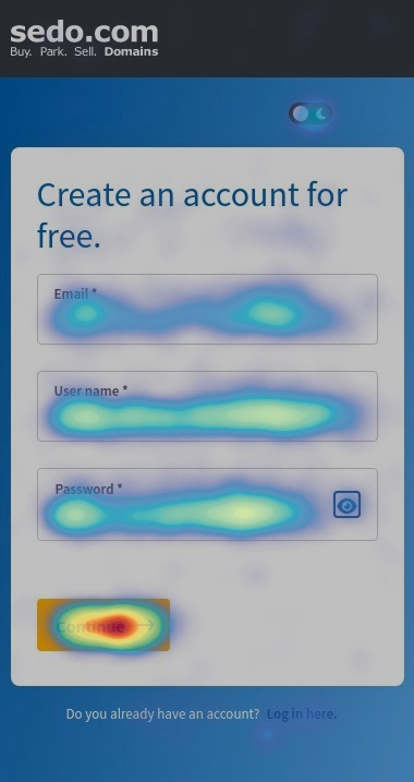
Registration heatmap from the product context; it does not isolate the effect of the design system.
The system supported production work over several years. MUI could adopt much of the existing visual language through a customised theme, preserving continuity in migrated areas. At the documented stage, both systems remained in use according to migration priorities. The outcome was a shared foundation that accommodated a change in technical direction; the available evidence does not quantify developer time saved.